The dream is simple: build a website, list some products, and watch the orders roll in while you sleep. However, the reality of digital commerce is far more complex. Statistics suggest that nearly 80-90% of new eCommerce businesses fail within their first year. Why? It isn’t usually because the product is bad; it is because beginners make ecommerce mistakes.
New entrepreneurs often get blinded by the visual aesthetics of their site and neglect the technical and psychological triggers that turn a visitor into a buyer. Navigating the digital marketplace requires more than just a “Buy Now” button. It requires a seamless user experience, a solid SEO strategy, and a deep understanding of customer behavior.
In this comprehensive guide, we will break down the critical eCommerce mistakes new store owners should avoid. By identifying these traps early, you can build a resilient, profitable brand that stands out in a crowded market.
What Common Mistakes Do First-Time eCommerce Sellers Make?
First-time eCommerce sellers often make small but critical mistakes that can impact sales, customer trust, and long-term growth. Understanding these common errors early can help you avoid costly setbacks and build a stronger foundation for your online store.
1. Choosing the Wrong eCommerce Platform for Your Skill Level
One of the first hurdles is selecting the engine that runs your store. Many owners rush into a platform because it is popular, not because it fits their needs.
- The Mistake: Choosing a highly complex, custom-coded solution when you have no technical background, or picking a “free” platform that lacks essential SEO tools.
- The Fix: If you want ease of use, Shopify is excellent. If you want total control and have some WordPress knowledge, WooCommerce is the gold standard. To understand this better, you can also read the article on WooCommerce VS Shopify. You might also find our article useful on best ecommerce platform for an online store—take a look; best ecommerce platforms for online stores.
Transitioning to the next point, once your platform is set, the way you present your products becomes the next make-or-break factor.
2. Using Poor Quality Images and Vague Product Descriptions
In a physical store, customers can touch, smell, and try on products. Online, your photos and text are the only “salespeople” you have.
- The Mistake: Using blurry photos taken on a cluttered kitchen counter or copying and pasting the manufacturer’s boring description.
- The Fix: Invest in high-resolution photography with a clean white background. Write descriptions that focus on benefits, not just features. Instead of saying “Cotton shirt,” say “Breathable, organic cotton that keeps you cool during summer hikes.”You can also go through lazy loading technique(Lazy loading is a technique that defers loading non-critical website content, such as images and videos, until a user scrolls down the page.)
3. Neglecting Mobile-First Optimization
Did you know that over 60% of all eCommerce traffic now comes from mobile devices? If your site looks great on a laptop but is a nightmare to navigate on an iPhone, you are throwing away half of your potential revenue. A deeper explanation of this can be found in our post on mobile Optimization.
- The Mistake: Having buttons that are too small to click, text that requires zooming, or pop-ups that cover the entire screen and won’t close on mobile.
- The Fix: Use a responsive theme. Test your checkout process on at least three different mobile devices before launching. Ensure your Call to Action (CTA) buttons are “thumb-friendly.”
4. Complicating the Checkout Process
Cart abandonment is the silent killer of eCommerce. The average abandonment rate is nearly 70%. Often, this is because the owner made it too hard to give them money.
- The Mistake: Requiring users to create an account before they can buy, or having a five-page checkout process.
- The Fix: Implement Guest Checkout. Use a progress bar so customers know how many steps are left. Keep the form fields to a minimum—only ask for the information you absolutely need to ship the order. Design also matters in the checkout process—review your checkout page design to reduce cart abandonment.
5. Hiding Shipping Costs Until the Final Step
Transparency builds trust. There is nothing a customer hates more than seeing a $20 item turn into a $35 item at the very last second because of hidden fees.
- The Mistake: Waiting until the user has entered their credit card info to reveal high shipping costs.
- The Fix: State your shipping policy clearly on the product page. Even better, offer “Free Shipping” by folding the shipping cost into the product price. Customers psychologically prefer a $25 item with free shipping over a $18 item with $7 shipping.
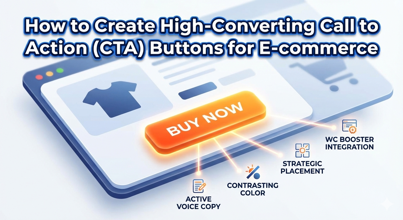
6. Lacking a Clear “Call to Action” (CTA)
As we discussed in our previous guide on WC Booster CTA blocks, a website without a clear direction is just a digital brochure.
- The Mistake: Using weak language like “Submit” or “Click Here,” or having a button color that blends into the background.
- The Fix: Use bold, contrasting colors for your buttons. Use active voices like “Grab My Discount,” “Start My Journey,” or “Add to Bag.” Make sure there is one clear goal for every page.
7. Ignoring Search Engine Optimization (SEO) Basics
You could have the best product in the world, but if Google can’t find you, no one else will either.
- The Mistake: Leaving image “Alt Text” blank, using generic page titles like “Home,” and ignoring keyword research.
- The Fix: Use tools like Google Keyword Planner to find out what people are searching for. Optimize your “Title Tags” and “Meta Descriptions” to include your focus keyphrase. For example, if you sell handmade candles, your title shouldn’t just be “Candles”; it should be “Handmade Scented Soy Candles | [Brand Name].”
8. Missing an “About Us” and Contact Page
People buy from people, not faceless corporations. New stores often forget to prove they are legitimate.
- The Mistake: No physical address, no “About Us” story, and no way to contact support other than a broken contact form.
- The Fix: Tell your story. Why did you start this business? Show photos of the team. Include a live chat option or a visible email address. This reassures the customer that if something goes wrong, someone will be there to help.
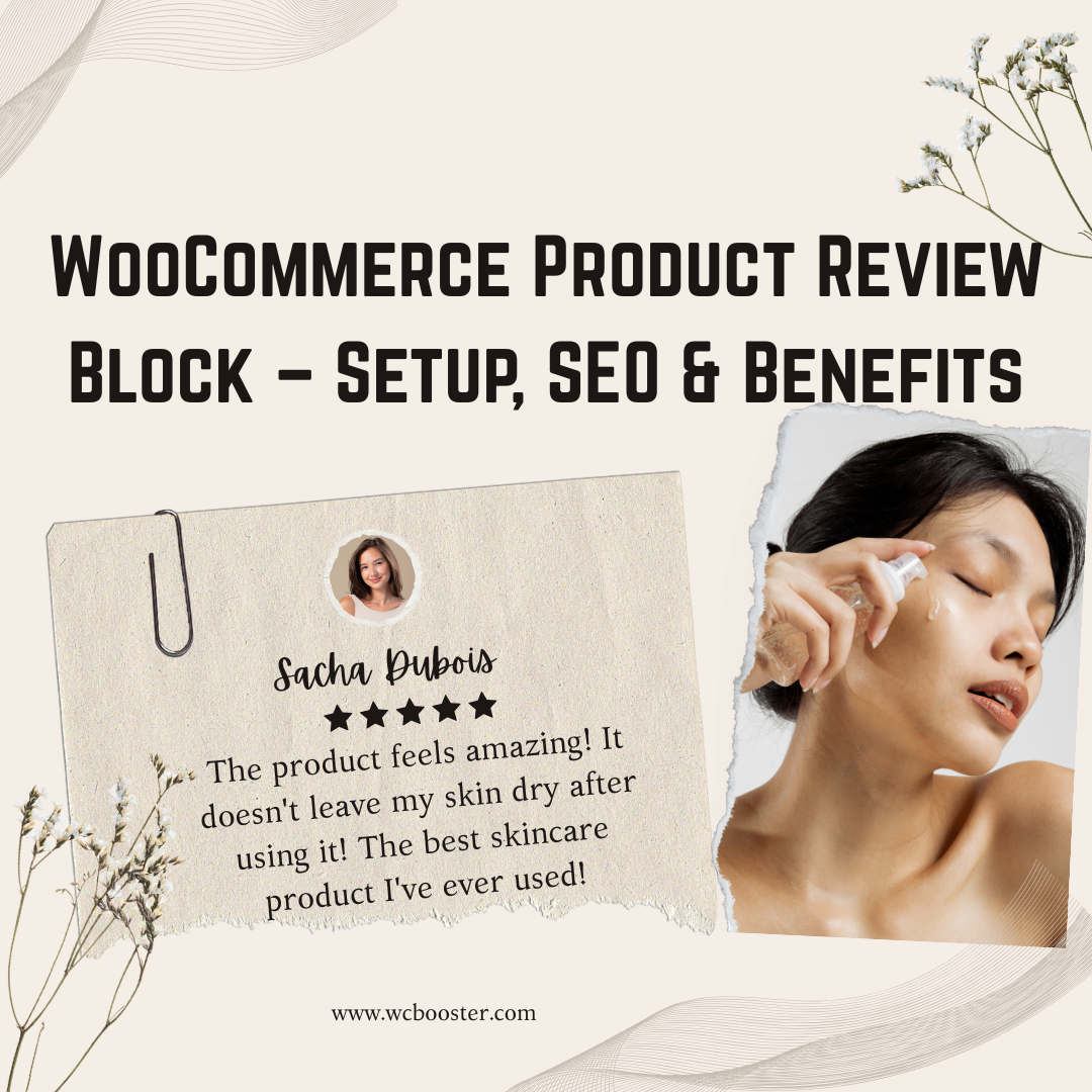
9. Overlooking Customer Reviews and Social Proof
First-time visitors are naturally skeptical. They want to know if anyone else has bought from you and if they were happy.
- The Mistake: Launching a store with zero reviews or, worse, using fake, “bot-generated” reviews.
- The Fix: Use a “Product Review” plugin. Offer a small discount to customers who leave a review with a photo. Learn about Product Review: it’s benefits and setup process. Furthermore, display logos of any publications or blogs that have mentioned your products to build instant authority.
10. Failing to Build an Email List from Day One
Social media algorithms change. Ads get more expensive. Your email list is the only traffic source you truly own. Campaign an email marketing and Learn more about this: How does email marketing work?
- The Mistake: Only focusing on one-time sales and not capturing visitor information for future marketing.
- The Fix: Use a “Lead Magnet.” Offer a “10% off your first order” in exchange for an email address. This allows you to follow up with people who didn’t buy the first time, significantly increasing your long-term Customer Lifetime Value (CLV).
Conclusion: Start Small, Optimize Often
In summary, dodging these Biggest Ecommerce Mistakes Beginners Make sets you up for success. From market research to analytics, each step builds resilience. Start small, learn continuously, and adapt quickly. Your store can flourish by prioritizing customers and data-driven decisions.
Remember, every successful eCommerce giant started somewhere—avoid these traps to join their ranks. Implement these tips today, and watch your business grow sustainably.
Pro Tip: If you are using WordPress, consider using the WC Booster plugin. It helps fix many of these mistakes automatically by providing optimized CTA blocks, faster checkout features, and better product displays, all designed to keep your site lightweight and fast.