Imagine a customer enters your online store. They look at your beautiful products, read your helpful blog posts, and browse your reviews. However, if they don’t know what to do next, they will simply leave. This is where the Call to Action (CTA) button becomes the hero of your website.
A CTA is a prompt that tells your visitor exactly what action to take. Whether it is “Buy Now,” “Sign Up,” or “Get the Discount,” this small block is the bridge between a casual browser and a paying customer. In this guide, we will explore why CTAs are vital for business, how to design them for success, and how the WC Booster plugin makes adding them easier than ever.
What is Call To Action (CTA)?
A Call to Action (CTA) block is a prominent section on a website or digital page designed to encourage users to take a specific, desired action. This action could be anything from “Buy Now,” “Contact Us,” or “Subscribe,” to “Download,” “Sign Up,” or “Get a Quote.” The CTA block typically combines clear, action-oriented text with visual elements such as buttons, contrasting colors, icons, or brief supporting copy to capture attention and guide users toward the next step.
The primary purpose of a CTA block is to drive conversions by reducing hesitation and making it obvious what the user should do next. An effective CTA block is strategically placed, easy to understand, and aligned with the user’s intent at that stage of their journey. By clearly communicating value and urgency, a CTA block helps turn passive visitors into active leads or customers.
How to add Call to Action Block in a website?
Adding a Call to Action (CTA) block to a website involves both strategic planning and basic implementation. The exact steps may vary depending on the platform you are using, but the core process remains the same.
1. Plan the Purpose of the CTA
First, clearly define what action you want visitors to take. This could be contacting your business, making a purchase, subscribing to a newsletter, or downloading a resource. The CTA text should be action-oriented and value-driven, such as “Get a Free Quote” or “Start Your Free Trial.” Decide where the CTA fits best in the user journey—commonly at the end of a page, after key content, or in a hero section.
2. Add the CTA Block Using Your Website Platform
- WordPress (Block Editor):
Open the page or post, click the “+” (Add Block) button, and choose a Button, Group, or Call to Action block (depending on your theme or plugins). Add your text, link it to the target page (contact form, checkout, etc.), and adjust alignment and spacing. There are various full site editing themes made with just blocks and control is on your hand. - Page Builders (Elementor, Gutenberg-based builders, etc.):
Drag and drop a Button or CTA widget, enter the CTA text, set the link, and customize styles such as color, font, and size. - Custom HTML Website:
Insert a button or link using HTML and style it with CSS to make it visually prominent. Ensure it stands out from surrounding content.
3. Design for Visibility and Clarity
Make the CTA block visually distinct by using contrasting colors, sufficient white space, and clear typography. Keep the message short and focused, and avoid placing multiple competing CTAs in the same section. The button should be large enough to tap easily, especially on mobile devices.
4. Test and Optimize
After adding the CTA block, test it across devices and browsers to ensure it works correctly. Monitor performance using analytics or heatmaps to see how users interact with it. Based on results, you can refine the wording, placement, or design to improve conversions.
Why CTAs are Essential for E-commerce and Business
In the fast-paced world of online shopping, you only have a few seconds to capture a user’s attention. If your website is confusing, you lose money.
1. Drive User Action
CTAs clearly tell users what to do next—such as Buy Now, Add to Cart, or Contact Us—reducing hesitation and decision fatigue.
2. Increase Conversion Rates
Well-placed, action-oriented CTAs guide visitors toward desired outcomes, directly improving sales, leads, and sign-ups.
3. Improve User Experience
CTAs provide direction and structure, helping users navigate the website smoothly and reach their goals faster.
4. Support Sales Funnel Progression
Different CTAs move users through each stage of the funnel—from awareness (Learn More) to conversion (Checkout Now).
5. Boost Engagement
Interactive CTAs encourage clicks, form submissions, and interactions, increasing time spent on the site.
6. Enable Measurable Performance
CTAs are easy to track, allowing businesses to analyze click-through rates and optimize designs, wording, and placement.
7. Reinforce Marketing Messages
CTAs align content with business objectives by converting interest generated by ads, blogs, or emails into concrete action.
8. Create Urgency and Motivation
Time-bound CTAs like Limited Offer or Shop Today prompt quicker decision-making.
10. Support Mobile and Accessibility Goals
Clear, prominent CTAs are especially critical on mobile devices and help ensure accessible, user-friendly navigation.
11. Maximize ROI on Traffic
CTAs ensure that hard-earned website traffic is effectively converted into revenue or leads rather than leaving without action.
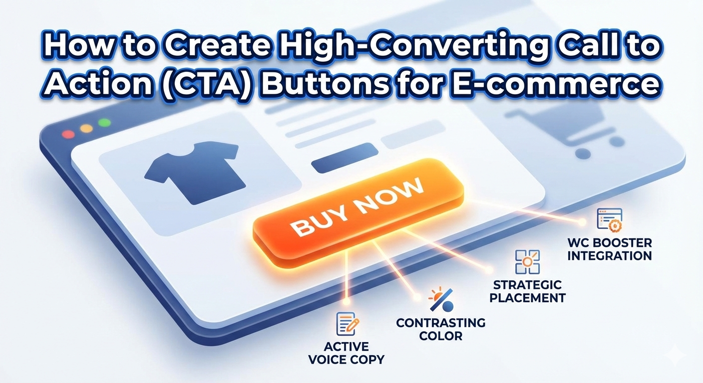
Key Elements of a High-Converting CTA
Not all buttons are created equal. To get the best results, you must pay attention to three specific areas: design, copy, and placement.
1. The Power of “Action” Words
Instead of using boring words like “Submit,” use active voices that spark excitement.
- Instead of “Click here”: Use “Get My 50% Off.”
- Instead of “Download”: Use “Start My Free Trial.”
- Instead of “Buy”: Use “Add to My Collection.”
2. Design That Demands Attention
Your CTA block should stand out from the rest of the page. Use a contrasting color that pops against your background. Furthermore, ensure there is enough “white space” around the button so it doesn’t look cluttered.
3. Strategic Placement
Place your most important CTA “above the fold” (the part of the screen people see without scrolling). Additionally, repeat your CTA block at the bottom of long pages so users don’t have to scroll back up to find it.
Using the WC Booster Call to Action Block
If you use WordPress and WooCommerce, the WC Booster plugin offers a dedicated Call to Action block. This feature is designed to be “minimalist,” meaning it won’t slow down your site while providing maximum impact. Besides the Call to Action block, WC Booster offers several other prominent and highly useful blocks that can significantly enhance your website’s functionality and user experience. To explore these feature-rich blocks in detail and understand how they can add value to your site, we encourage you to check out the Free WC Booster blocks.Want to unlock advanced features? Click here to discover the Premium Blocks available in WC Booster.: Premium Blocks in WC booster.
Why Use the WC Booster CTA Feature?
- Ease of Use: You can simply drag and drop the CTA block into any post or page using the Gutenberg editor.
- Customization: You can easily change colors, border radius, and fonts to match your brand.
- Responsive Control: It ensures your buttons look perfect on mobile devices, where most e-commerce happens today.
- Lightweight: Unlike heavy page builders, WC Booster keeps your code clean, helping your SEO rankings.
Conclusion
A well-crafted Call to Action button is a small element that can have a massive impact on your e-commerce success. By understanding the principles of effective design, using compelling active language, and placing your buttons strategically, you can significantly boost your conversion rates.
Don’t underestimate the power of a clear directive. Take the time to review your product pages and ensure your CTAs are working hard for you. With helpful tools like the WC Booster CTA block, creating high-converting buttons is easier than ever. Start making these changes today and watch your clicks turn into customers
Common Questions About CTA Blocks (Questionnaire)
To help you master this tool, let’s answer the most frequent questions business owners ask:
Q1: How many CTAs should I have on one page?
- Answer: While you can have multiple, you should have one primary CTA. If you give users too many choices, they might choose nothing at all. Use one bold color for your main goal and a “ghost” button (transparent with an outline) for secondary goals.
Q2: Does the color of the button really matter in CTA?
- Answer: Yes! While there is no “magic” color, the key is contrast. If your site is blue, an orange or yellow button will stand out best.
Q3: Should I use icons in my CTA blocks?
- Answer: Specifically, yes. Icons like a small shopping cart or a “right arrow” can increase click-through rates by providing a visual cue of what happens next.
Q4: Can I use CTAs in blog posts?
- Answer: Absolutely. In fact, you should. Use the WC Booster CTA block inside your articles to lead readers toward a related product or a newsletter signup.