You’ve worked hard to attract customers to your e-commerce store. They’ve browsed your products, added items to their cart, and shown clear intent to buy. But then, at the final hurdle – the checkout page – many abandon their purchase. This moment is critical; it’s where countless sales are won or lost. What if you could subtly influence their decisions, reducing friction and guiding them smoothly to a completed order? The answer lies in understanding checkout psychology.
The design of your checkout page isn’t just about aesthetics; it’s a powerful tool that leverages human psychology to encourage conversions. Small tweaks, often seemingly minor, can have a dramatic impact on your bottom line. By understanding how users think and what motivates their actions, you can optimize your checkout experience to build trust, reduce anxiety, and make the purchase process feel effortless. This guide will reveal 10 proven design tweaks rooted in checkout psychology that you can implement today to significantly boost your sales.
Why Your Checkout Page Is the Key to More Sales?
The checkout page is not just a form; it’s the final handshake with your customer. A strong understanding of checkout psychology ensures this handshake is firm and reassuring.
- The Final Hurdle: Customers are committed, but easily spooked. Hidden fees, complex forms, or a perceived lack of security can quickly deter them.
- Trust is Paramount: At this stage, customers are entrusting you with their money and personal information. Your page must radiate trustworthiness.
- Decision Overload: Too many options or distractions can lead to analysis paralysis, causing customers to abandon their carts.
- The Last Impression: A smooth checkout leaves a positive lasting impression, encouraging repeat business and referrals.
10 Easy Ways to Improve Your Checkout Page for More Sales
Implementing these actionable design changes can significantly improve your conversion rates without needing a complete overhaul.
1. Embrace Guest Checkout Options (Reduce Friction)
- The Change: Offer an obvious “Checkout as Guest” option. Don’t force account creation.
- Why it Works (Psychology): Many first-time buyers do not want to commit to an account. Requiring registration introduces friction and feels like an unnecessary barrier. Therefore, a guest option reduces commitment anxiety, allowing them to focus on the purchase.
2. Utilize Clear Progress Indicators (Manage Expectations)
- The Change: Implement a simple, visual progress bar (e.g., “Shipping > Payment > Review”).
- Why it Works (Psychology): People like to know where they stand. A progress bar sets clear expectations about the number of steps remaining. Consequently, it reduces perceived effort and prevents users from feeling lost or surprised by a lengthy process. This is a core tenet of checkout psychology.
3. Optimize Button Colors for Action (Call to Action)
- The Change: Make your primary call-to-action button (e.g., “Place Order,” “Continue to Payment”) a contrasting, prominent color that stands out.
- Why it Works (Psychology): Bright, contrasting colors draw the eye and clearly indicate the next step. Therefore, it guides the user visually, reducing hesitation and ensuring they know exactly what to click to complete their purchase. This is a fundamental aspect of checkout psychology.
4. Employ Trust Signals Prominently (Build Confidence)
- The Change: Display security badges (SSL, payment processor logos like Visa/Mastercard), customer service contact info, and a link to your privacy policy.
- Why it Works (Psychology): Customers are sharing sensitive information. Trust badges visually reassure them about security. Furthermore, accessible contact information reduces anxiety, knowing they can get help if needed. This is crucial for checkout psychology.
5. Minimize Distractions (Focus the User)
- The Change: Remove unnecessary navigation menus, social media links, or excessive promotions from the checkout page.
- Why it Works (Psychology): Every additional element or link offers an escape route. By minimizing distractions, you create a focused tunnel for the user. Ultimately, this guides them solely towards completing the purchase, a key goal in checkout psychology.
6. Implement Autocomplete for Forms (Reduce Effort)
- The Change: Enable browser autocomplete for address fields and suggest relevant options as users type.
- Why it Works (Psychology): Typing long addresses is tedious and prone to errors. Autocomplete reduces typing effort and speeds up the process. Consequently, this eliminates a common point of frustration and saves time.
7. Provide Clear Error Messaging (Offer Guidance)
- The Tweak: When an error occurs (e.g., invalid credit card number), provide immediate, clear, and polite feedback. Highlight the specific field needing correction.
- Why it Works (Psychology): Ambiguous error messages create confusion and frustration. Clear guidance helps users quickly correct mistakes. Therefore, they don’t abandon the checkout out of exasperation. This improves checkout psychology.
8. Summarize the Order Clearly (Reassure and Confirm)
- The Change: Show a prominent, easily viewable order summary, including product names, quantities, individual prices, and the total cost.
- Why it Works (Psychology): Customers want to be certain about what they are buying and for how much. A clear summary provides reassurance. Ultimately, it prevents last-minute surprises that could lead to abandonment.
9. Leverage Urgency/Scarcity (Gentle Nudge)
- The Change: Use subtle, honest urgency or scarcity cues (e.g., “Only 3 left in stock!” or “Order in the next 2 hours for next-day delivery”).
- Why it Works (Psychology): This taps into the fear of missing out (FOMO) and encourages immediate action. However, use it sparingly and genuinely to avoid appearing manipulative. This can be a powerful checkout psychology trigger.
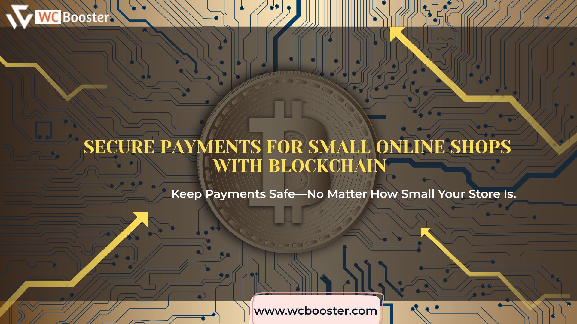
10. Offer Multiple Payment Options (Increase Flexibility)
- The Change: Support a variety of popular payment methods (credit cards, PayPal, Apple Pay, Google Pay, etc.) or a secure payment with blockchain. Instead, you can enhance payment with a digital wallet or Buy Now, Pay Later Service.
- Why it Works (Psychology): Customers prefer using payment methods they are familiar with and trust. Therefore, offering diverse options caters to individual preferences and reduces perceived barriers to purchase.
Conclusion: Master Checkout Psychology, Master Your Sales
Your checkout page is more than just a functional requirement; it is a meticulously designed conversion funnel. By understanding and applying the principles of checkout psychology, you can transform a potential point of friction into a smooth, reassuring, and efficient journey for your customers. Remember, even the smallest design enhancement, like a clearer progress bar or a more compelling button color, can significantly impact your sales figures. Stop leaving money on the table. Invest in optimizing your checkout experience, build trust, reduce abandonment, and watch your e-commerce business thrive.
Ultimately, making your checkout page a seamless experience is a huge win for both you and your customers. To ensure your WooCommerce store provides the fastest, most customer-friendly checkout or for multistep checkout, consider giving WC Booster a try—its features are designed to simplify the final step for everyone.